Ryan Standfest lives in Detroit, Michigan. Ryan’s work speaks to the trauma of modernity.
Ryan produces images and situations that lean toward the graphic nature of cartooning, formally, and relies on expressions of an absurd (and sometimes satirical) character.
Ryan has taught a course called “The Graphic Novel,” which despite its name, has nothing to do with the graphic novel. Rather, the course guides students through the history, development and practice of comics/cartooning as a sequential art form.
You can find Ryan on the web at ryanstandfest.com.
Relief print with hand coloring, 12″x9″
Relief print with hand coloring, 12″x9″
Did you grow up reading comics, and did you have any moments in your life when you stopped reading comics??
I began reading comics in 1984, at the age of ten. I stopped reading during the years 1993 to 2002. This was a time of transition for me, in which I grew tired of superhero comics and the excessive marketing of them, and grew to like alternative/independent “non-cape” comics or “comix.”
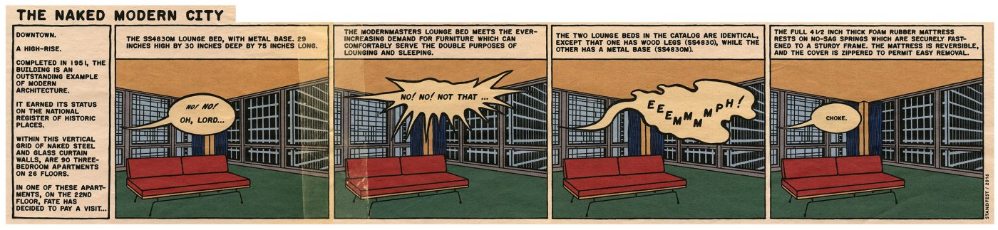
Pigment print, 7.5″x27″
Have you ever felt embarrassed or ashamed about reading comics?
No, never! Comics were my gateway to art and taught me to read images and draw. I take a great deal of joy in singing the praises of the comics medium, whenever I can.
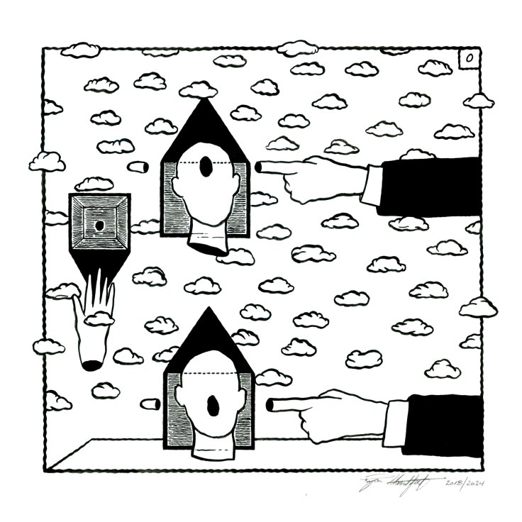
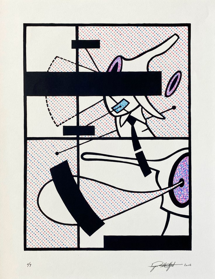
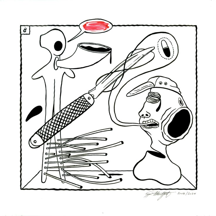
Ink on Bristol card, 6.5″x6.75″
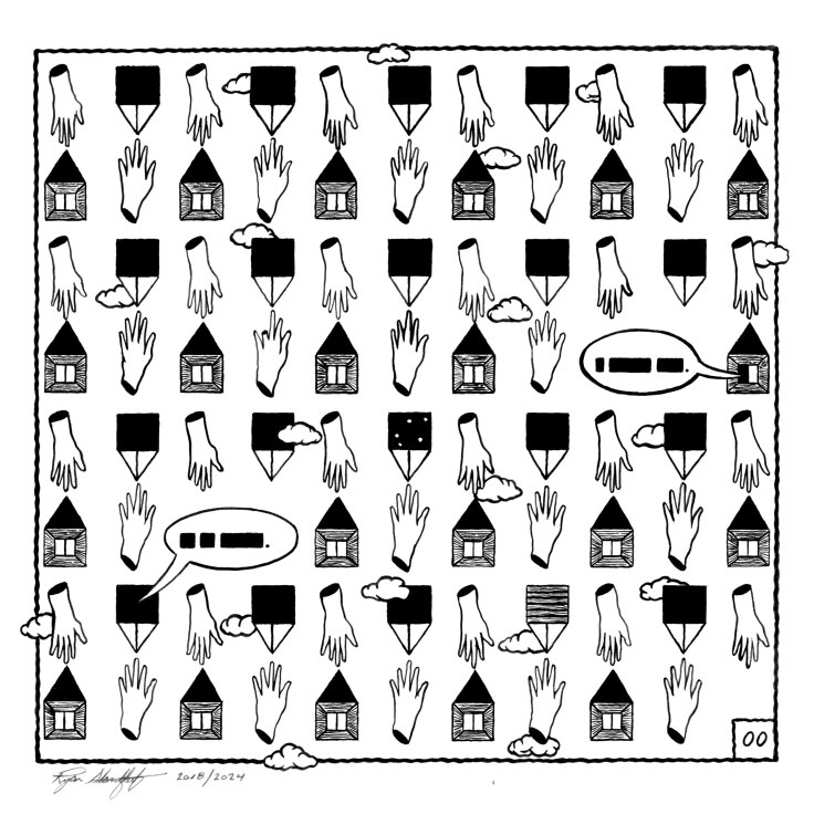
Ink on Bristol card, 6.5″x6.75″
Do you have a favorite comic shop that you visit?
I visit Vault of Midnight in Detroit. They have a great selection of independent books and work from the European publisher Humanoids.
The most memorable comics shop I visited was in Amsterdam, c. 2001. It was the Lambiek comic shop in its original Kerkstraat location, where it had been since 1968 (it moved in 2015). It is the oldest comic store in Europe, and the oldest operating store in the world. I recall having a Dutch-style pancake, or pannekoeken with stroop– an incredibly thick, molasses-like syrup right down the street from the shop. This was pre-cellphone and I was unable to find Lambiek, until, while eating my pannekoeken in the outdoor cafe, I saw the sign (“Stripboeken”) for it on the next block. It was such a beautiful shop, with wonderful wood cabinets and shelving, dim lighting, overflowing with original comic art and European comics. The business card was designed by Chris Ware as a miniature comic book printed in green and black. I kept that little book in my wallet for years, until it accidently ran through the washing machine! The owner of the shop was Kees Kousemaker (who died in 2010), and I had a great conversation with him about Dutch comics. I distinctly remember his moustache. I had purchased a book of work by Robert Crumb titled “Odds & Ends,” published by the Amsterdam-based Oog & Blik, and as I was thumbing through it, discovered a page containing Crumb’s advertisement for a record shop called Car City Records. That shop was at the end of the street I grew up on, a block from my house! Kousemaker wanted to know all about the record shop.
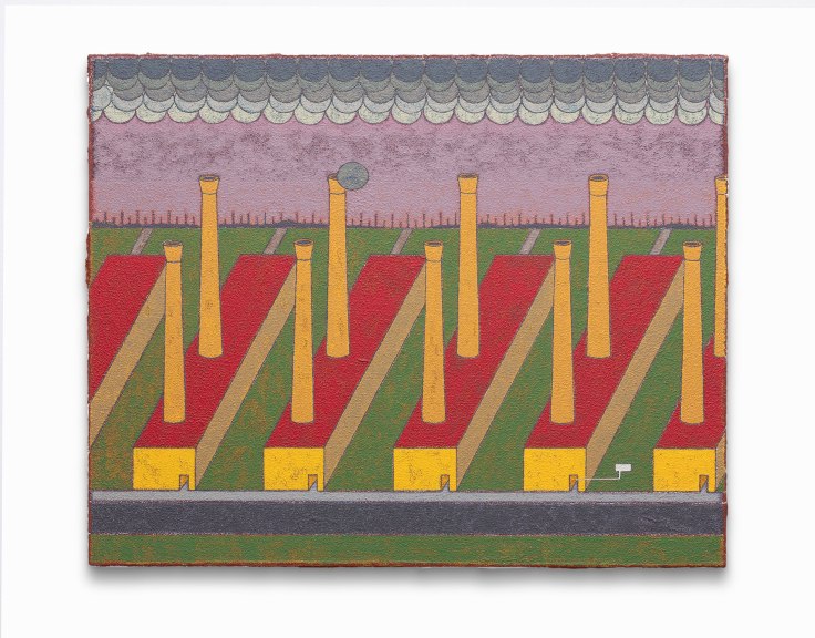
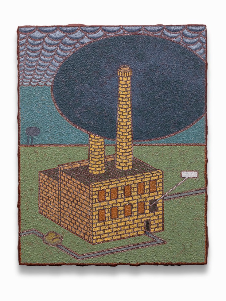
Acrylic on wood panel, 16″x20″
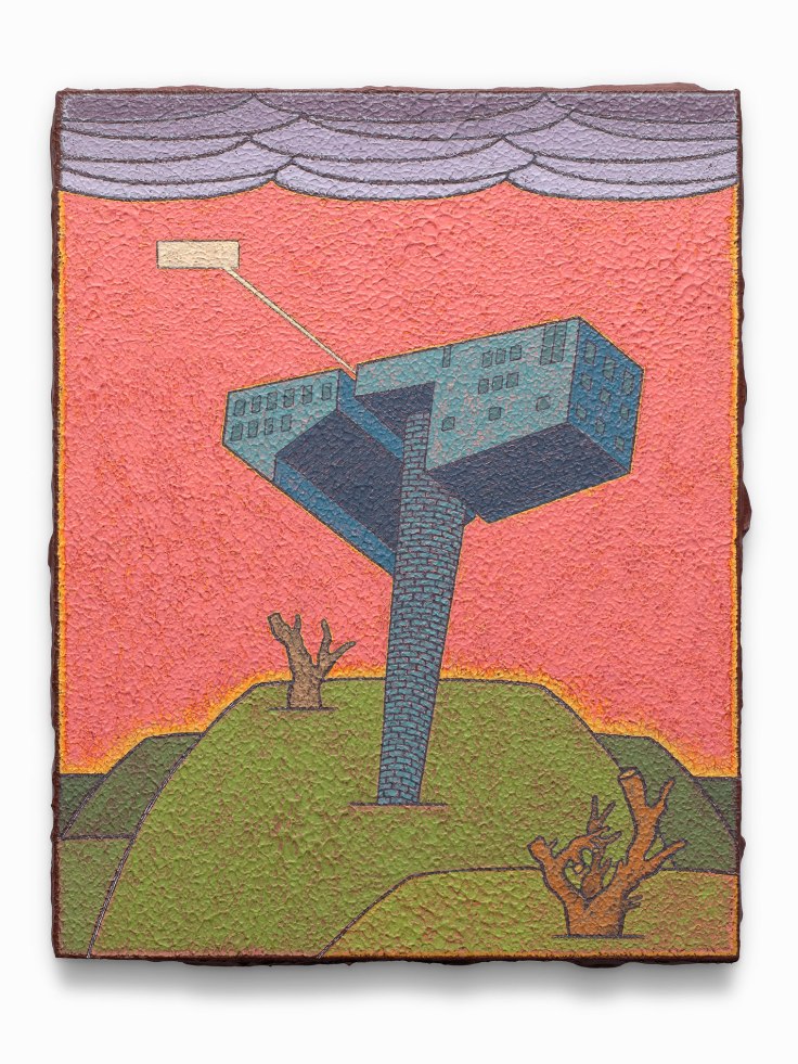
Acrylic on wood panel, 14″x11″
Is there an important comic shop or friend who opened your eyes to comics?
No. I came across comics on a spinner rack in a pharmacy, when I accompanied my grandfather on his routine visit to buy a pack of Phillies Tips cigars. It was 1984. My eyes turned to a copy of Marvel Tales (issue #156, reprinting “The End of Spider-Man”/The Amazing Spider-Man #18, from 1963). I distinctly remember the smell of the comics. I begged my grandfather to purchase it for me, and he did. Around the same time, I was also completely immersed in Mad magazine, taking a particular delight in the Al Jaffee fold-ins, and the comic strips of Don Martin and Alex Prohias (“Spy vs. Spy”).
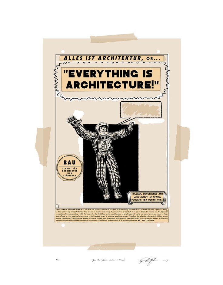
Five-color screen print, 24″x18″
How do comics inspire or inform the work you make?
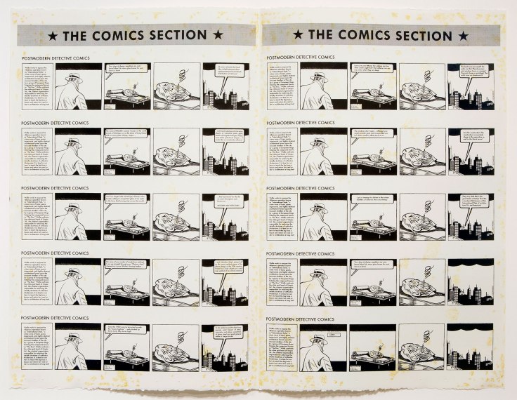
As long as I can remember, I’ve never taken an interest in the narrative element of comics– the stories and characters never moved me, but the architectural mechanics of comics, or the design of comics, has. By this, I mean the use of sequentiality and multiple panels beside one another (whether the democratic grid or the hierarchical grid), speech bubbles, a directionality of action, and a graphic organization of space. The greatest influence that comics have had on me, is a wholly formal one: as an architectural expression. For me, it is how the page is constructed, how the visual information hangs together and flows as a strategy of communication.
I guess the sight of all those panels and speech bubbles coalesced in my mind as a constructivist conceit. I tend to paint like a printmaker, separating and layering color in flat areas, then bounding with a key black line. I think this started with my experience of the printed language of comics. When I was a young, I would begin by reading the text portion of the stories, but soon read the images exclusively. I was always interested in the background landscape of comics set in the city. When reading the early run of “The Amazing Spider-Man” as drawn by Steve Ditko, I’d linger on the spaces– Ditko’s version of New York City or of a villain’s lair.
The relationship of comics to my art is, I think, much the same as it may have been for the Chicago artists of the 1960s– The Chicago Imagists (particularly Roger Brown), in which cartooning and comics are an essential part of a visual culture that lodged itself in my art consciousness, and has continued to marry its language to how I reorder and reorganize the world, my world, visually. I continue to look to the work of such artist-cartoonists as Saul Steinberg, Richard McGuire, the Swiss artist Helge Reumann, Chris Ware and the 1960’s Mexican art comics of Alejandro Jodorowsky, looking for ingenious methods of structuring space and time. Lately, I have been returning to a magnificent graphic novel titled “Soft City,” by Norwegian artist Hariton Pushwagner. As much of my work is centered on architectural forms and their historical narratives as they relate to the story of modernity, the work of the Dutch cartoonist and graphic designer Joost Swarte, who uses the “ligne claire” or “clear line” style of Hergé (Swarte coined the term “clear line”) has been a continual source of inspiration. Trained as an industrial designer, there is a rationality to his imagery that speaks to my sensibility or at least the kind of imagery I enjoy, as a viewer and a reader. The use of irony and a detached, highly refined line, within a rigorously constructed environment, is most satisfying. A particular interest of mine, is in a conceptual comic strip titled “The Angriest Dog in the World,” that was authored by the artist and film director David Lynch. It was published in the L.A. Reader from 1983 to 1992. The four panels that comprise the strip, never change (in fact it is a single panel repeated four times with the fourth slightly different), but it is merely the text that changes, made up of jokes and deadpan one-liners. Not only did I edit and publish the first collection of this strip in 2020 for my micro-press Rotland Press, but I’ve borrowed from this strip more than once, as a static expression of the absurd. An ancestor of the Lynch strip is a painting by René Magritte that is also a conceptual comic– it has a space reserved in my personal pantheon of “great art”– titled “L’Homme au Journal (Man with a Newspaper)” from 1928. The repetition and miniscule changes in this image haunt me when I think of attempting similar moves in my work. Magritte manages to compress and expand time, creating a space that, through repetition, slows down the viewer to read every bit of the image. Additionally, some of my recent paintings and drawings have borrowed a bit of George Herriman’s western landscapes in “Krazy Kat,” a true work of American comic modernism. While I’m thinking of it, a book that I truly love is 40 Days Dans le Desert B by Moebius. First published in 1999, around the time I got my hands on a copy through Bud Plant (a incredible mail order catalog of comics esoterica I used to find rare international titles in), the book is 70 pages of a wordless sequence in which a meditating figure in a desert simply sits as mystical visions blossom and swirl around him. It is a tour de force that I return to now and again when I think of the power of sequential dreaming and the notion of an unfolding space with repetition and variation.
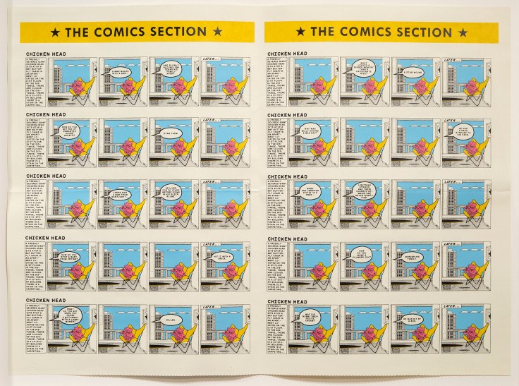
Ffive-color screen print on folded and cut paper, 28″x35″
How long have you been making work that references comics?
I don’t know if I so much as “reference” comics, but have imbibed the language of its visual construction for so long, taken so many trips to the “comics watering hole,” that anything I make still has the tinge of those spirits, even if it may not be overtly so. But as far as a “mature” manifestation in my work of comics language? Probably since my graduate school days at the University of Iowa c. 2005-2006. I know that in my childhood, my friends and I would gather for drawing sessions, and would copy images from comics. I believe this is where I truly learned how to draw. At that time, I would love to draw cutaway views of villains lairs, the Bat Cave, and even of Peter Parker’s secret darkroom where he would develop the photos he took as Spider-Man, as drawn by John Romita is an early “Amazing Spider-Man” Giant Size Annual (if memory serves). I would label everything with captions and arrows.
Ink on Bristol card, 6.5″x6.75″
Have you ever been afraid or worried about making artwork that references comics?
No, why the hell should I?! It is clearly such a part of our collective visual culture, that it forms a common artistic language helping an audience slip into a work. If anything, sometimes I feel like I need comics language to manifest itself in my work more than it does.

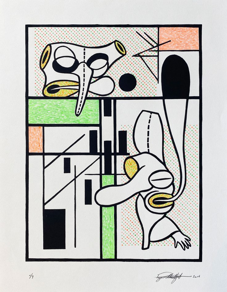
Acrylic on wood panel, 16″x20″
Acrylic on wood panel, 14″x11″
BONUS QUESTION: What question about comics or your work would you like to be asked?
Have you ever attempted to make a comic (strip or book)?
Yes. Exclusively single page-length comics. About a dozen or so. They are in a more experimental vein, driven by a sequence of conceptual “gags,” where humorous juxtaposition is the primary driver. I consider them failed experiments that only I find funny.
2-color lithograph, 26.5″x35″
(produced at the Frostic School of Art, Western Michigan University with the assistance of
Nichole Maury and Patricia Villalobos Echeverría)
